

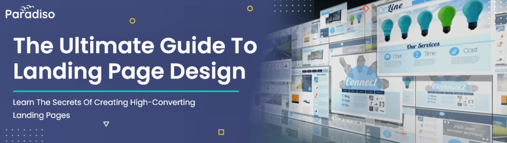
The first thing people see when visiting your website is a landing page. This page can make or break a potential customer’s impression of your business. An excellent landing page design can inspire visitors to take action and become a new customer. It should tell your brand’s story and encourage people to purchase or sign up for a service.
If your landing page design needs to be updated, you may miss out on potential leads and sales. It is especially true if you spend money on digital ads to drive traffic to your landing page, but no one is converting. It could even result in a loss of money for your business.
You must focus on optimal design and best practices to create high-converting landing pages. In this post, we will provide landing page design ideas and examples to help you create a landing page that drives conversions and grows your business.
What is a Landing Page?
A landing page is a webpage with a specific objective – to get visitors to perform a particular action. Typically, people arrive at a landing page through digital marketing campaigns, such as advertisements. Therefore, the page should be designed to engage and influence the intended audience to respond to the call-to-action (CTA).
The CTA may be signing up for a newsletter, downloading an eBook, enrolling in a course, or purchasing a product. Every aspect of a landing page, including its layout, imagery, and text, should support the goal of getting the visitor to take the desired action. A well-designed landing page can be an effective tool for achieving high conversion rates and growing your business.
Landing Page vs Homepage: What’s The Difference?
Understanding the difference between a landing page and a homepage is important. A homepage is designed to appeal to a broad audience and provide general information about your brand. For instance, Paradiso Solution’s homepage showcases all its products, from project management to CRM, to cater to its diverse customer base.
However, when Paradiso solution runs Google Ads for specific products, it creates dedicated landing pages. So, for example, if you search for project management tools, you’ll see an ad that leads you to a project management-specific landing page. Similarly, searching for CRMs may lead you to a CRM landing page.
A landing page aims to target a specific audience and encourage them to take a particular action, such as signing up for a free trial or making a purchase. Landing pages have a clear and focused message, while home pages are broader in scope. Understanding these pages’ differences is essential for crafting an effective digital marketing strategy.
How to Write a Landing Page
Before creating a landing page, you must write a compelling copy. These landing page design tips will guide you in crafting copy that effectively communicates your brand story, product or service and encourages visitors to take action.
1.Create Your Unique Selling Proposition (USP)
To create an effective landing page design, answering four critical questions can help form the outline and make it stand out. The first question is about defining the offer, followed by the benefits of the offer. Next, explain why your audience needs your offer immediately and how they can access it. These questions create a sense of urgency and convince the visitors to take action.
Finally, these questions are the foundation for building your page’s unique selling proposition, also known as the value proposition. A Unique Selling Proposition is a statement that highlights the reasons why a customer should buy your product or service. In summary, these four questions provide a clear roadmap for crafting an enticing landing page design that converts visitors into customers.
2.Understand your audience’s needs and desires.
When you create a landing page design, keeping your audience and competition in mind is essential. Your landing page copy should be customized to your audience’s needs and desires. It would help if you considered what benefits they will receive from your product or service and how you can solve their problems. It will be easier to write compelling copy if you understand your audience’s hopes, ambitions, and goals.
You can visit online communities and forums where your target audience is active to gain insights into their preferences. Additionally, conducting competitor research by auditing their landing pages and analyzing their positioning is essential. It will help you identify where you have a competitive advantage.
3.Crafting High-Converting Landing Pages with Power Words
When creating a landing page design, your main goal is to convince your audience to convert. To achieve this, your copy should be clear, persuasive, and focused on your unique value proposition – what sets you apart from your competition. Using “power words” in your text can evoke emotions and establish a connection with visitors, increasing the likelihood of conversion. Three powerful words to use are “you,” “because,” and “imagine.”
- You- create a feeling that your product fulfills your audience’s desires
- Because- sets up an explanation of the reason why.
- Imagine- helps them visualize the outcome of their purchase.
You can also get inspiration for power words from existing customers, online communities, and forums. To ensure your message resonates with your audience, ask for feedback from friends, peers, or audience members. A/B testing can also help determine which message performs better. Remember, your landing page should communicate your value proposition and convince visitors why they should choose you over your competitors.
What are The Crucial Elements of a Landing Page?
1. Headline
The first thing people see on your landing page is your headline. Therefore, it’s essential to make it short and clear and reflect what your audience seeks. An example is SHAMPORA, which sells custom skincare products. Although its headline says, “The world’s most customized skin care.” it tells customers that the product is made just for them, not anyone else. The company also uses a quiz to help customers customize their skincare routine, reinforcing the product to be personalized.2. Subheading
Your subheading comes after the headline and provides more information about your offer. It’s usually smaller in structure and lets you give more details about your offering. For instance, Slack’s subhead highlights the advantages of using their tool for work, allowing users to work more efficiently and flexibly.3. Images
It’s essential to have a great image on your landing page. It can be a picture of your product or something related to your message. But, of course, a photo of your product in action is even better. Research shows that our brains process images much faster than text, so having a captivating image can make your page look more appealing and make it easier for your audience to understand your offer. In addition, a good image can keep your audience interested in your page and encourage them to learn more.4. Benefits
To convince your audience to buy your product, explain how it solves their problem. For example, in the benefits section, address the pain points you’ve identified for your audience. Use a bulleted list to explain how your offer solves their pain problems directly. Focus on the benefits of your product, not just the features, as adding too many features may need to be clarified or describe their decision, which can lead to them not buying at all.5. Social proof
Social proof is when you show your audience that other people have used and liked your product or course. It helps to build trust and increase the chances of people buying from you. Different ways to show social proof exist, such as customer reviews, testimonials, and press features. Social proof is significant for creating landing pages that effectively get people to take action. You will often see the social proof on a landing page, usually near the top, so that people can see it immediately.6. Call-to-action
Your call-to-action (CTA) is the button or link on your landing page that tells people what to do next. It’s the most essential part of your page because it helps convert visitors into customers. Your CTA should be clear, concise and placed in a prominent location on your page. Avoid using vague terms like “submit” or “send”; be specific about what will happen when someone clicks your button. You should only have one CTA on your page to ensure your visitors have enough options.CTA Landing Page Design Tips
- Make your CTA text look like a button by enclosing it in a box.
- People are more likely to click buttons.
- Have the button change color or shade when the mouse hovers over it. It attracts attention and shows it is clickable.
- Color contrast matters more than the color itself. Choose a complementary color that stands out from your site’s main color. For instance, use an orange CTA button if your background is blue.
- Ensure the button is more extensive than other text on the page so it can be noticed.
- Include white space around the button to make it stand out from everything else on the page.
How To Create a Landing Page Successfully?
Effective landing page-building platforms
Creating high-converting landing pages doesn’t require you to be a web designer or developer. Many do-it-yourself builders offer user-friendly interfaces and hundreds of landing page templates. These can easily be integrated into your website to maintain a consistent user experience.
Platforms such as Paradiso CourseCart, Instapage, Unbounce, and HubSpot are a few options for designing your landing page. For example, with Paradiso CourseCart, you can create a landing page for a course in 10 minutes. These platforms provide an easy way to design and launch a landing page without the need for technical skills.
5 Guidelines to Follow for Designing a Landing Page
The next section will discuss essential design elements when creating a landing page. Whether you use a course builder or hire a designer, you must consider key factors such as color, typography, and images.
1.Select impactful colors with noticeable differences.
Many marketers’ debates whether colors affect conversion in landing page design. To keep it simple, there are a few elements to consider when choosing colors for your landing page design and brand. First, every color has psychological implications that affect emotions and perceptions. So, when selecting your landing page color palette, consider what characteristics you want your brand to convey to potential customers.
A.Meaningful Effects of Colors
Choose colors that represent the characteristics you want to show. For example, if you want to create a feeling of trust and luxury, go for blue and black. If you want to evoke a sense of health and optimism, use green and yellow.
B.Always choose complementary colors
Having contrast in your landing page design is crucial. Complementary colors can make the colors appear brighter and more vibrant. Ensure your palette includes a color that complements your page’s main color. Pick easily readable colors. Avoid using colors that make it difficult to read your text, like the blue text on a green background. Instead, use a light background with dark text to make it easier for people to read.
2.Choose the right fonts.
Choosing the right fonts for your landing page design can be challenging. Using commonly available Google web fonts such as Georgia, Verdana, and Arial are recommended. These fonts are compatible with most browsers and operating systems.
To reduce clutter, stick to one font style and use bold or italic styles to differentiate text. Using these fonts can also make dealing with various email service providers easier. However, check the licensing requirements before using them for your business.
3.Select Appropriate Font Sizes
Using different text sizes can also help you distinguish and emphasize certain information. For example, studies have found that body text is most readable at 12pt, and headlines look best at 17 to 25pt. However, increasing the font size to 14pt may be better for older audiences. Anything smaller or larger than 12pt can decrease readability. You can experiment with different font sizes in various sections of your landing page design to guide readers to the most essential information. Additionally, having enough space between each line is important to make it easy to read.
4.Choose high-quality images
Choosing the right image for your landing page is essential, as it can enhance or diminish the overall message you want to convey. High-quality, clear images that do not compete with your message are preferable. Consider your page layout and how the text will look on top of the image. If the image is occupied, using a darkened effect with Photoshop can make the text easier to read. A helpful tip is to add a dark rectangle over the photo and adjust the opacity to make the image dark enough to make the text more readable.
5.Ensure your landing page is mobile-friendly
Once you have designed your landing page, it’s essential to ensure it looks good on mobile devices because a large portion of your traffic will likely come from mobile. Using the landing page design tips outlined above, you should understand how to convert customers. To improve your landing page, try out different designs and test them using A/B testing. Analyzing the results lets you fine-tune your page and see how users interact with it. For those creating a landing page for course, Paradiso Ecommerce LMS offers a sales page template to simplify the process.